Saturday, June 22, 2013

The Pull List: Weekly Comic Reviews for 19/6/2013

Hey again. I missed out on reviewing last weeks stuff but I have extended reviews (or spotlights) on Superman Unchained #1 and Batman #21 because these two titles were pretty important for D.C going forward and I wanted to leave it awhile cause it gets a bit spoilery!

Anyway back to now. This week had a few winners and losers . . . and I'm just going to get to it.

Age of Ultron #10

Right let's deal with this 'thing' first.
The final issue of Bendis's time traveling limited series was pegged as unguessable but instead became the final hope for all of us who honestly felt dupped for paying $40 dollors (or more if you got the tie-ins) for the last couple of months.
Realistically it doesn't matter if this was a knock-out masterpiece, it comes too late after the lack luster 9 before. This isn't a masterpiece, it is a big improvement in terms of pacing and has intrigue coming out of it's ears but the heroes' solution to Ultron is a stiff step for step execution of a plan so obvious that it causes you're eyes to roll all the way back and fall down you're throat. Plus this solution was spelt out 2/3 issues ago!! Annoying!!
To it's credit the finale does let readers know how and where this event took place and it ties in surprisingly smoothly!
The introduction which focuses on Hank Pym is fun and much more convincing than anything else to do with this series's initial premise. After his solo page time things go down hill and everything is tedium from there i.e boring predictable solution to threat etc.
Then readers get to page 20 and things change (literally), and interest levels rise considerably. But everything after page 20 is like an epilogue showing different scenes where the aftermath of the AoU showdown has been felt. This is interesting, it is fun but the following 15 pages are essentially sneak peaks of other events and titles that are going to come our way in the near future. This isn't surprising, Marvel have used events to launch spin-offs for yonks, but this time, AoU, was so 'in you're face' about it that one can't help but feel cheated. This is the main problem with this issue and the series as a whole; In the end the series' premise was a shallow face job for Bendis and co to shift the direction of Marvel onto tracks that they have devised for the future of the universe. This shift would be fine but they did it at the expense of a story.
The art was good but there was alot of pencillers. 10 in total! on a 34 page book! Too much. The highlight was Quesada's contribution at the end.
Okay enough on this.

Score 4/10

Avengers #14

The 14th installment of Hickman's Avengers title is a prelude to the fast approaching 'Infinity'; Marvel's blockbuster summer event.
In this issue all of the title's large cast of Earth's mightiest are on call and the seeds (pun intended!) planted by Hickman back in the first issue begin to flower, readers get to see the first pieces come together of what will hopefully be the first crescendo of this new volume.
Dropping all character focus for a fast paced and fluid issue, this book is clearly kicking things up a gear or two. Thankfully smart dialogue doesn't allow the characters to become secondary to the curious sci-fi shinannigans and instead the foundation of previous issues allows the frighteningly large group to flourish in the chaos. And there is chaos aplenty in these pages but its all fun and so well managed by Caselli who has some seriously nice pencil work (I think he also did the inks), his Captain Marvel is awesome. Also Frank Martin continues to imbue a cool mix of colors that really add to each page.
Plenty of interesting things going on all riding on the writers trademark use of giving answers that reate more questions. And the cliffhanger ending! Entertaining start to finish. Not perfect; One knows Hickman can do better, falling planes and satellites is a bit too clíche.

Score 8/10

New Avengers #7

Let me just start by saying that this cover is so cool. Great work by Deadato plus it's Namor and Black Panther. So cool.
In contrast to the adjective-less Avengers this title's latest is a much more subdued book (one could argue that most of the series has been . . . I know). 
This issue is an insight into what happens when there isn't a universe threatening incursion just hours away and it mostly isn't good. Without the imminent threat to bind them the Illuminati get embroiled in more personal matters.
Wakanda advances it's war effort against Atlantis and Namor and T'Challa have words. Doctor Doom summons Reed to discuss what the ruler of Latveria saw last issue (very enjoyable conversation). Blackbolt is up to something mysterious on Attilan involving a certain mad brother of his and Beast is teaching The Black Swan latin.
All very well written but a bit of a quiet one, this book is a chance for Hickman to flesh out the group dynamics and also highlight some of the personalities involved.
Smart and convincing, the book brings pathos and adds new elements besides the repetitive danger of the incursions.
A great bonus is Hickman's cute explanation of how the Illuminati's members, like Ironman, can be in this title and also be a galaxy away in another. It's a nice touch that isn't over done but may trivialize the situation surrounding other titles.
Deadato's art is so nice to read through. His line work is spot on for the title, even more so than any of the other Avengers books. Again Frank Martin is on colors and again it's well done start to finish especially with the chunks of white and black which make a nice contrast on the pages.

Score 8/10

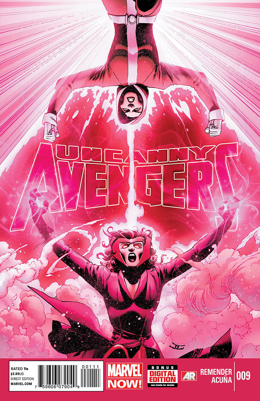
Uncanny Avengers #9

It's an avengers week this week! This 3rd Avenger title returns readers to Remender's 'Unity' team after last issue saw them being hit by an enormous explosion courtesy of the Apocalypse Twins after they blew up Akkaba Metropolis!
Now back at the mansion the team are facing a dire threat in the latest form of celestial gardeners and worst is they don't know how to start dealing with them.
Wolverine's past is at the core of the trouble and the intro depicts the former X-Force leader dealing or not dealing with past actions and horrors.
The rest of the team are also buckling under the pressure but more problematic is how they all constantly argue.
Cap is finally rescued from South Sudan but not before a fateful encounter with a holo recording. What he learns could be the key to victory or the final straw that breaks the team.
All the while the Twins move effortlessly onward with their plan. They have collected enough death seeds and are ready to make some Horsemen!!
This month's issue is a joy to read and moves very well between different scenes and parallel view points.
The dialogue is top notch especially with the twins who are fast developing into finely tuned antagonists adding another page to the mythos of Apocalypse.
The Unity teams dynamics are well set as a cornerstone of the book and the uneasiness of the mutant and non-mutant pairing is a compelling element of both the mutant world and overall Marvel world.
The blow-out argument in this issue feels a bit like Remender is going back over what he wrote Alex saying he didn't want to be called a mutant (see issue #5) and it's a bit heavy on the speech bubbles.
The art by Acuña is, as always, so full of energy and great panel layouts that flicking through the pages is as far from boring as can be. No page is lazy and the boldness of the colors is a great aid in making everything stand out.
And the ending! I can't wait for next month's issue. Whopper!

Score 8/10

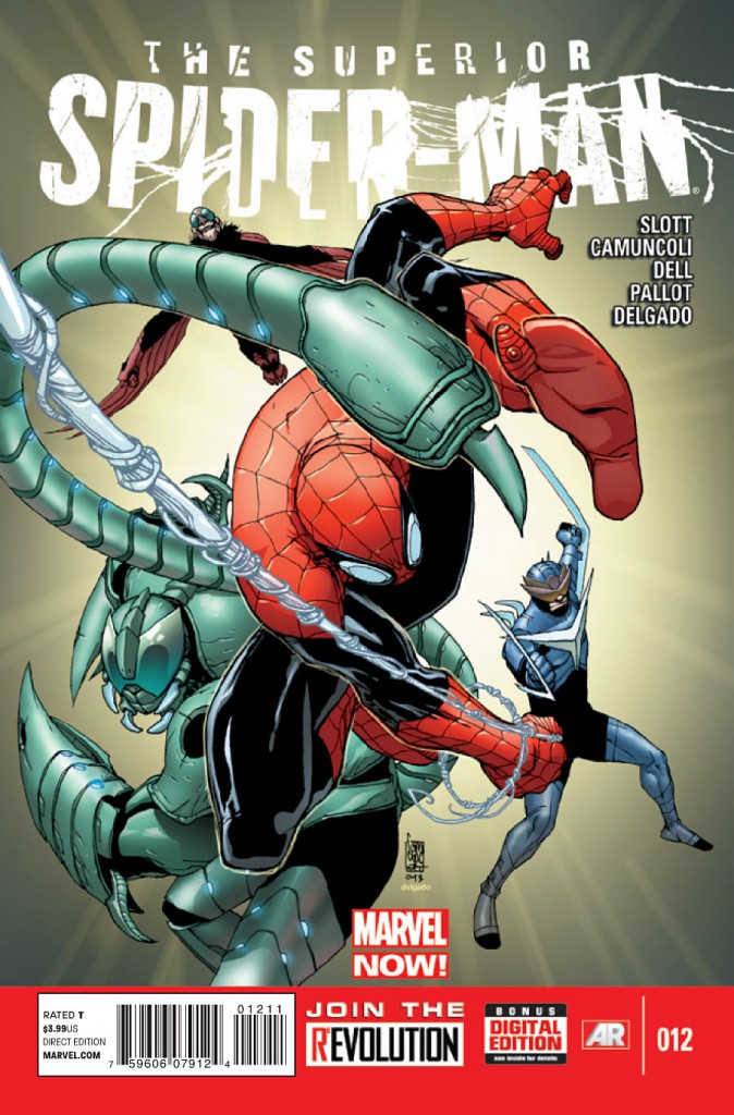
The Superior Spider-Man #12

Smythe has avoided execution but Spider-Man is only a step behind him. The spider and the slayer are now trying to outwit each other as both pull out plenty of tricks to gain the upper hand.
Slott does the plott for #12 but Cage is on Script. Interesting? Cage does the job well delivering some nice bits of bubble talk from not only Otto but also some of the support especially Norah Winters who gets a Star Wars quote in and Jameson makes a daring move that could spell disaster for himself but also has a little talk with Spider-Man that is very interesting. Why was there a Spider-Bot there watching the conversation? I guess the future well let us know, hopefully.
Meanwhile Smythe puts down his trump card; his newly refurbished Vulture, Scorpion and Boomerang! These reinforcements are more than a bit trite but matched with the increasingly chaotic occurrences happening elsewhere on the raft they make a thrilling tale.
The pencil work by Camuncoli is really well done. For the most part the panels are kept to a minimal but it works, allowing the images more space to show off the great action scenes and the gorgeous depictions of Spider-Man being Spider-Man (Camuncoli does a great web slinger). The color art by Antonio Fabela suits the pencils and his choice of background colors are ace but more credit to the inkers John Dell and Terry Pallot and solidity to figures and making them pop that bit more.

Score 8/10

Ultimate Comics: All New Spider-Man #24

A much much better example of Bendis' skill as a writer.
This issue is not really about Spider-Man, he's more like a guest star in the book. Instead this is Ultimate Comics: Cloak & Dagger #1. Yes the whole book is dedicated to the back story of the Ultimate universes latest re-imagining of ol' 616 staples. This isn't a bad thing, it is interesting and is very well written with plenty of classic romance and tragedy inside to please any hero fan. Plus a further look inside the world of Roxxon Foundation and it's mysterious and equally infamous brain trust builds plenty excitement for the future.
And Miles just sort of runs away.
Straight forward and simple but no complaints cause it was all good and had really good dialogue which felt natural and believable.
The pencils and inks by Marquez is soooo good. His panels are smart and always clearly laid out and he plays around with it but more amazing than that is his linework which is always crisp.
The colors by ponsor are also really sharp and always add depth to every scene.
Great stuff but more Spidey please.

Score 8/10

Indestructible Hulk #9

  The last of the Marvel Titles for this week's reviews, Indestructible Hulk is one that I dropped after Leinil Yu left the book but this issue's cover by Rivera and the inclusion of Daredevil made it too hard to leave alone.
The start of a new ark #9 sees Hulk team up with his not-so-secretive legal backer as S.H.I.E.L.D drops the green behemoth on top of an arms dealing sea cruiser which has all to casually appeared in the middle of the hudson river.
The Man without fear tries to help but things don't go to plan. Shocker! and a chase ensues.
Straight forward and simple but well written funny and entertaining. This issue isn't going to blow you away but does what it's supposed to; tell a story and entertain. Also the last page reveal is an eyebrow raiser.
The books newest artist Matteo Scalera fits in well with Waid's writing and his edgy linework and proportioning add something to the panels with the Hulk causing a storm round him. The amount of black didn't do it for me and on a more critical note it detracted from Scalera's linework and gave little room for color. Who is to blame; Colorist or Inker, I don't know.
This book was fun but not blazing any trails. I don't think I need to jump back on board.

Score 7/10

Batman and Batgirl #21

The latest issue from Tomasi has the Dark Knight paired with Barbara after last month's starring the Red Hood.
Unfortunately #21 doesn't stack up to the previous few issues that had all been so strong since Damian's death.
Instead this issue is boring in it's premise and the dialogue, though studded with odd poignant gems, is mostly naff and inorganic being often heavy handed with the emotional overflow caused by the Boy Wonders demise. It's a shocker considering how well the previous issues handled it.
The story follows Batgirl who is following Batman who is continuing to pummel thugs to vent his now-curdling grief. Batman has been doing this for a while now and Batgirl's presence offers nothing near as powerful as Tim or Jason's crossings with Bruce.
The unmemorable situ of beating thugs to support what was meant to be a powerful moment between the two Gotham vigilantes is unfair to readers especially when there is little power to be had.
There are moments; Batman comes out with some great balloons now and then and really comes down on Barbara for thinking she can reel him in.
The penciller is Cliff Richards who has to follow up after the brilliant work of regular artist; Pat Gleason. He falls short. LIke the script his linwork shines in some panels but more often seems flat and static but his panel arrangements make up for it a good bit. One can see in this issue the significant role Gleason has on the title. The success of the story may actually be majorly due to his unique visualization of the scripts. 
A medicore stumble for what has been a strong title thus far.

Score 5/10

Green Lantern; New Guardians #21

I guess this is really where things change direction for Kyle and the Guardians. The ol' crew of differing spectrum ring bearers have been dropped in favor of the more title appropriate crew of . . . New Guardians; the new batch of blew fellas who replaced the ones that tried to wipe out all life.
Kyle, the white lantern, has been charged and convinced by Hal to act as a tour guide for the little blue people. Their first stop is to the edge of the universe to study something known only as 'the anomaly'!
It's a good idea having a GL book focus on the Guardians and Kyle is the most plausible bridge also this anomaly has some interesting notions surrounding it and the cliff-hanger at the end is superb.
But this issue isn't perfect; the pacing is, at times, absurd, thankfully it sorts itself out at the crucial final third of the book which was by miles the only genuinely engaging part of the whole issue.
The dialogue wavers from page to page with pathos being supplanted by meaningless philosophical rambling (less is more and all that).
Brad Walker's compositions and layouts help make the story more fluid to move through and the kinetic energy is non stop page to page but his character poses sometimes look squashed and also anatomically weird.
Wil Quintana does the colors and add another layer of energy to really make the action hit home.
Fun but the book stumbles as much as it succeeds.

Score 7/10

Monday, June 10, 2013

The Pull List: Weekly Comic Reviews for 5/6/2013

Hey all. Back again for another round of critical analysis on some comic book stories. It was a very big week that just went by with a lot of new title issues on the shelves. I'm going to do the usual half a dozen and then, hopefully, have a few more tomorrow.

So let's do this!

Superior Spider-Man #11

Otto Spidey is having a great ol time lately. He recently gave the 'other guy' that was floating around in his subconscious the boot and has been cleaning house all over Manhattan and the greater N.Y city (see recent Avenging Spidey issues) and has also been shown to have a better grasp on Peter Parker's life than Pete ever did himself. So this issue introduces the proverbial spanner to Otto's hot streak by having all his meticulous planning fall short leading to a nice finisher that will be sure to bring back readers for #12.
The dialogue throughout is great and as usual the gold is Otto's own musings and the self conflict that erupts within the villain-now-hero.
His character continues to shake Peter's world and in turn how that world see's Peter/Spider-Man. More and more the ripples of Octavius' actions spread and more and more the hero Spider-Man becomes increasingly complex. I for one hope that Otto's usurping of the mantle has an impact that is felt far into the future of Spider-Man.
Camuncoli's art here is stunning. His version of Peter (Otto-Peter), while still recognizable as the much loved man from Queens, sports a bit of pomp slickness in appearance that communicates Otto's influence perfectly. His pencil work is sharp and well defined. Just check out the one page splash on pg.8 . . . so good. Delgado's colors continue to be perfectly keyed to the tone and help make some panels, especially any involving a fight, come out at the reader a bit more.
A great, well rounded issue by Slott and co.

Score 8/10

All New X-Men #12

This installment of the hottest X title 'now' includes alot of really interesting interactions between one teenage Scott and his adult younger brother Alex plus Jean unintentionally (well she said she didn't mean to but . . . ) finds out why mutants have been having such a hard time lately plus and maybe not so interestingly Mystique and her lot continue to rob banks.
So there is a good bit going on in this issue and the bulk of it is solid with high quality writing from Marvel's main architect; Bendis. The stuff between Scott and Alex alone is wonderful, it really gets ya in the feelz.
Also! also this issue actually starts exactly where the last one ended!! well except for a brief 2 page pov of Alex's.
At this point one must understand that frustration could be felt by some, and I myself have made note in a previous review, that this title's direction isn't clear due to it continually going back over itself and older material and the constant encounters with other super groups and the repeated back and forth all generally revolving around what should be done with the original X-Men; 'they should be sent back asap'etc. All this talking leaves little room for the main characters to move towards a goal. Baby steps are being made in this Issue but the problem is still there.
Immonen continues to amazing panels, he continues to create great image layouts and dynamic panel layouts. Immonen contiues to knock it out of the park. Rain Beredo is the colorist on this issue and does great work but it doesn't differ much from what Gracia had been doing up till now.
Like I said; this issue wins on the Scott/Alex bit alone.

Score 7/10

Age of Ultron #9

This is the second Bendis title being reviewed today and sadly, but maybe expectantly, this is much weaker than ANX-Men.
What can I say about Age of Ultron. Well for a start, and I have mentioned something about this before but, did Ultron decide that this story was a bore and left!? Where the heck is the title antagonist?
The introduction is spent on an alternative universe that has obviously been born die and then the rest of the book goes back to the past where AoU Wolverine and Sue Storm are about to murder Hank Pym to prevent him from building Ultron . . snore . . snore .. oh wait is that another wolverine!! (it's not a spoiler cause it's on the cover!) This other new Wolverine doesn't do anything to help things, if anything his appearance causes the book to slump even further into tedium.
And the answer to all there problems; good god could it be any more lazy!
Awful stuff from one of Marvel's biggest names. Nine issues in and all I can think of is why did I waste my money. I know that I may appear to be verging on unfair ranting but no I'm not. One just has to think of the title, Age of Ultron, and easily imagine how easily awesome it could and should have been.
Peterson and Pacheco continue to split pencils and panels; present and past respectively. They do solid work but can't help this story at all and neither can the inks or the colorist, the editors could have but oh well.
I guess Marvel fans will have to hold out for the inevitable epilogue mini series and probable spin-off on-going to actually get anything from all of this but you really shouldn't support that kind of soulless scheme.
Walk away, just walk away.

Score 4/10

Daredevil: Dark Knights #1

I am going to end on a positive for my Marvel releases and what a high note this is. 
'End of Days' has just ended but fans of the Red Devil fear not cause this new series (I'm not sure if it's limited, I'd love if it wasn't) is beautifully written and illustrated by Lee Weeks who does a powerful job delivering an issue that contains plenty of grit and somberness all to the setting of a harsh and intense N.Y blizzard. In fact the setting, the snow blizzard, may well be the star of the show because Weeks has described and drawn such a convincing and engulfing scenario and it plays such a role in why the events unfold as they do. The setting also lends itself to some stand out panels both in terms of image and action.
Writing-wise Weeks goes biblical; quoting the old testament, and while I have issues over this particularly over drawn well I have to say that it is well suited to the Man without Fear and his background which Weeks entwines the holy excerpts into in a convincing fashion. Mixed with the word of God is the many aspects of morality that exist in man that Weeks also deftly shapes within the claustrophobic snow of the storm as D.J's risk freezing to warn of muggings and homeless Samaritan's save lives while people pull guns in hospitals and one man, a man with no sight steps out into the cold white to save one life. 
Art wise this packs a lot of power too with smart sketchiness and even smarter panels that it would give the Daredevil on-going a run for it's money. Lee Loughridge's colors bring plenty to the table; never complacent they shift and match the story and spike in boldness at certain dramatic points.
A work of art through and through.

Score 10/10

Astro City #1

This, I am ashamed to say, is the first Astro City issue I have ever read!
On the upside this offers me a chance to do a new-comer review of the much loved series' as it relaunches under the 'Vertigo' banner.
Kurt Busiek, considered a master of comic writing, does what one of his caliber should be able to and balances introducing new readers to the world of Astro City while pleasing regulars by picking up where the title left off a few years back, so no alienation and no boring backstory context setting etc. On this first point alone Busiek and the book deserve much credit because I personally found the book not only inviting but also intriguing through the scope of characters and hints of backstory and weight of history that existed in the world that I know nothing of but maybe returning fans would. All this past did not dissuade because of the smart writing style of Busiek, instead it beckoned one to stay on board, to learn more and to buy the next issue.
The story in the here and now also brings in new blood with some new heroes like American Chibi (the big headed girl on the cover) who gets a few pages to herself. The whole thing is narrated by one character, the Broken Man, who breaks the third wall by addressing the audience and also goes further by acknowledging that he is in a comic book!
 This issue's main focus however is a door and the figure that emerges from it, this alien doesn't go unnoticed but only requests a guide to help become familiar with the world it has arrived into. How does the Broken Man know everything that is happening? Who is this visitor and what are it's intentions? Who or what is the Oubor? and what role does Ben Pullam play in all this? All the exciting mystery!
Brett Eric Anderson is on pencils and inks and does a fine job. Excelling in terms of panel layout and image composition Anderson's work fails slightly on close-ups, his faces being slightly bland and, at times, oddly shaped.
A unique title and a big start that dares one to not hold on for #2.

Score 8/10

Earth 2 #13

The newest chapter from James Robinson may just be the most exciting and interesting yet!
The focus of the story is the introduction of the New 52 version of Captain Steel; a Filipino native who had a prototype liquid metal bonded to his frail form and was reborn a super strong, highly durable wonder who has a couple of other abilities that I'm not sure the pre-52 version had.
So Steel has been ordered by the U.S to enter a fire pit left from the great war with Apokolips next to Rio de Janeiro to find out what is going on inside. Meanwhile Hawkgirl gains the attention of some unwanted riders as she moves further with her investigation of Sam's murder. Plus there is a brief and spooky appearance of a certain fellow who showed up in last week's annual (still have to get my hands on a copy!) and a one page splash ending that is very very cool in terms of pencil work but also drops a shocking reveal of an evil lurking within the fire pit.
Robinson is on ace form with his writing. It is a well balanced read that flows effortlessly from background info to climactic suspense to the edge-of-you're-seat ending. Not a panel too wordy. Just perfect which just makes it upsetting that the man is leaving the title soon.
The art is also really exciting. Cinar is so well tuned into what this title is about. His images just strike the mark in terms of edginess and dynamic compositions with full panels that are all well laid out and all are clear and easy to follow. Kudos to Pete Pantazis on colors, who brings solidity to each image with slick reds and bluesand great changing hues to some of the panels that really set the tone.
The best yet just wish there was more pages so they could fit in The Flash, Fate and GL.

Score 8/10

Legends of the Dark Knight #9

I must apologize, I think last week I referred to this but mistakenly called it Tales of the Dark Knight. So sorry to confuse.
This issue is split into two stories. The first and longest is dedicated to an unspecified encounter between the Batman and Scarecrow. The twisted doctor has a new hallucinogen for the crusader and what follows is Wayne's attempts to discern reality from illusion as he is faced with a most tragic nightmare. A fine example of Batman's quick mindedness and resolve but also a peek into a hovering future most bleak. Well written by Christos Cage, this tale is written with all the emotional weight and desperation that the nightmare needs to really be felt.
Jeremy Raapck's pencils and panels do the job and even standout on some pages where panels have been very smartly positioned and close-ups on faces are perfectly keyed to the right expression. The colors like the outline are good if a bit too bright at times but work best during the close-up conversation panels.
The second story is my favorite. It's a simple one about Batman trying to catch up with Catwoman mid burglary and one trying to outsmart the other. Simple but clever and a lot of fun with some highly enjoyable panels. Better still is the art which is beautifully done by Stephane Roux, outline, colors, inks, the lot all beautifully done with plenty of exceptional panels that all work neatly together and never get cluttered.
A fun issue that may have done even better if the focus on the stories had been reversed.

Score 7/10


Tuesday, June 4, 2013

The Pull List: Weekly Comic Reviews for 29/5/2013


Hey everyone. Here is the reviews for last week's releases. I missed out on some good stuff especially   Earth 2's annual so not too much to get through.


X-Men #1

Let's start off with a strong one from Marvel. This latest Marvel Now/X title has been well advertised and much has been expected from the star pairing of Brian Wood and Olivier Coipel.
The issue has plenty going for it and delivers on what fans wanted; a highly intriguing  intro built upon by a mix of believable mutant school antics, the return of an old favorite (with a highly endearing guest in toe), some smooth x vet action involving a train and a nice twist at the end. What more can you ask for?
Coipel's pencil work and layouts are on the mark. His panels are perfectly arranged to suit the building momentum of the story and even though nothing as epic as a the battle from New Ultimates (for e.g) is happening, to his credit, Coipel never lets the energy lag making the finish more satisfying than it may have been without him. Pencil wise he brings the usual style that is much loved. With an all female cast one can imagine that Coipel must be actively trying to avoid making them look too similar (every penciller has a recognizable way of drawing faces) and he succeeds . . . most of the time but this is me being nitpicky so don't let it put you off. Laura Martin is the colorist and is, as always, making the pages come to life with the perfect range of color to make the book dynamic and pleasing to flick through.
I don't think I've been as satisfied with an X book in a long time, in fact this one stirred memories of Jim Lee's stuff in the 90's which for me means a lot cause it's the reason I got into the X-Men in the first place!

Score 9/10

Wolverine and the X-Men #30

So now for the second X-title that I picked up this week. I have to admit I dropped this ages ago, whenever they went to the circus, and I haven't bothered with it since because it never stood out until now because this issue is pegged as the prologue to The Hellfire Saga!
Aaron is still at the helm but this is far from his best at the mo (see Thor instead!!), rather than being a compelling start to an enticing event this prologue is a predictable read whose parts are more entertaining than the overall story.
Yes, in it's favor, there are stand out segments to the book including a true to form moment between Kid Omega and a Bamf and the ending is decent but it's let down by the parts dedicated to Beast and Broo which are obvious in there result and include one of the most badly named unknown villains ever. Worse still is the intro which is such a waste of time that one of the characters involved says so word for word.
The art is annoying. There are 3 pencillers involved and I don't recognize each by they're style but the art on the first 2 pages is not great. The panel layout is static and the expression on the two heroes don't match the situation that they are in plus the colors don't work with the pencil style.
The rest of the pencil work is good but all momentum is lost when the artwork changes with a page turn. Overall the colors are sufficient but not adding anything to the page and at times the lack of color shading is too much.
A disappointment overall, really, especially when I thought that this 'saga' was going to bring me back on board WatXM. 

Score 5/10

New Avengers #6

This is a man's world. At least it feels that way when you look at 7 powerful and brilliant men taking the fate of countless planets into their own hands and like to keep a blanch skinned beauty in a perspex prison!! but just like the song this issue would be nothing without this woman, curiously named the Black Swan, it is her character that stands out from the rest. Story wise she is also essential as the Illuminati must now turn to her to help them avert the next incursion. On top of this she is there to explain all the sci-fi jumbo to both readers and avengers alike.
This issue was pegged to be the one where the band of heroes must destroy a planet to save their own! Exciting!! but absolutely unexciting is what actually unfolds inside (stupid misleading beautiful cover). The action here culminates in a new complication in the ongoing collisions of all realities and the introduction of new villains whose motivation is old hat and whose design is completely forgettable but in among this meh is an old adversary whose involvement in the incursions is anything but dull.
Regardless of the level of questionable action taken by the Avengers, Hickman does still instill a sense of moral compromise and a reminder of what a 'hero' is or isn't through compelling dialogue from the books stars.
The art by Epting continues to meet the tone of the story. Simple panel layouts with epicness inside; a nice contrast of grand figures and bleak surroundings all of which is aided by D'Armata's well paired colors that shift when needed to match the mood.
A lot of good here but it's let itself down with a mediocre climax.

Score 7/10

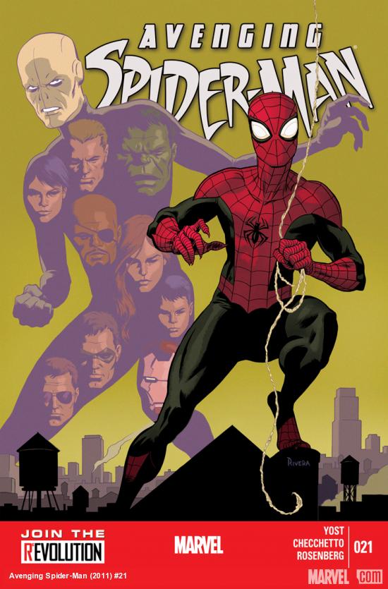
Avenging Spider-Man #21

The Chameleon Sanction Part 2/2!

So for some unknown reason Superior Spidey goes after The Chameleon who is hold up on a S.H.I.E.L.D Helicarrier and just as he makes his move a bunch of old KGB/Soviet types along with a super powered pair called Th Saints also bust on board to kill the Russian impersonator. So now we're all up to date.
As with part 1, this month's installment is highly enjoyable with stellar pencil and ink work by Marco Checchetto who really packs in alot in every panel, the guy could give Hitch a run for his money.
Story wise this is all out action and entertainment from Yost who hasn't failed yet at nailing exactly what one imagines Superior Spider-Man is all about. Smart. fun with a couple of epic pages and a zinger ending and readers don't have much to complain about.
I hope that Spidey's behavior isn't simply forgotten after this issue because Ock was overtly suspicious at times and unfortunately the 'new' Nick Fury was always there to be a dupe and play it down. The man is meant to be the new Nick Fury!! Yeah right. In this issue he was way too trusting and dismissive. This out of character portrayal of Fury Jr. is the books only real flaw and can be ignored.
The art shines through and the ending gets the eyebrows raised!! Success.

Score 8/10

Adventures of Superman #1

The latest Superman title from D.C, this originally was released digitally but I like to get stuff in print for various reasons soooo how does it fare?
The main story by Jeff Parker is great. It is straight up classic Superman and I don't just mean the costume. This is the Man of Steel self propelled to the fore of a situation he must remedy asap.
The action is all age friendly but doesn't let itself fall into feathered conflict and over zealous moral lessons, it instead moves fast into a predicament that, typically, Superman cannot deal with and the fun ensues with a laugh out loud moment that leaves physics (I am bearing in mind that it's Superman) a few blocks behind.
The pencils and inks by Samnee are full of energy and are spot on for the story with some great panels that capture Superman's ability and character perfectly. Plus the cover by Samnee is awesome, the chains make one believe this may have been for 'Unchained'. The colors by Wilson are ideal and give the images an animated feel like you could see this same art on t.v.
The two other stories drop the ball quite a bit in comparison to Parker's. The second is pointless. I can't decide who it was targeting. Kids? Why? If kids wanted to look at playing superman in a make believe game then they'd just go out and do it. Adults? To induce endearment, nostalgia? It fails in this respect because the the ending and subsequent point of the story is both too simple and yet agitates a bunch of nerdish questions in opposition to the end. All endearment would be lost on any D.C reader.
Also the art is beyond the type considered pleasing in it's childlike naiveté, i.e it's just childlike.
The last story is a bit better with Supes confronting Bizarro. Superman's solution to Bizarro is frustratingly simple that it renders previous encounters with the antagonist moot but you still have to laugh at it. The art does the job, it suits the story but fails to push the pages in any interesting direction.
This may possibly be Superman's answer to ToTDK but it'll have to be more consistent if it wants to be considered on par.

Score 7/10

Batman The Dark Knight Annual #1

This is a successful change of scene for this done in one annual by Greg Hurwitz and illustrated by Szymon Kudranski. It stars 3 of Batman's classic foes who are mysteriously brought together on a Halloween night in a well known and eerie location. What follows is insightful, at times unsettling and hilarious.
Like so many annuals, this one is not what one would call essential. Don't get me wrong, it's really entertaining but it's not pushing the Bat or his world in any degree. Instead it leaves all current events behind for an unknown time and focuses on 3 villains with plenty of baggage. Readers are treated to a story that moves effortlessly between lightheartedness to darker moments that remind one why these people are who they are. The dialogue is also fluid with conversations moving from shared jokes to insane outbursts.
Best of all is the ending which is expected but never the less succeeds to bring a smile to you're face.
The linework is beautiful with just the right amount of noir and gothic in it's style to match the setting plus the villains are spot on. The panels are always changing in layout from page to page making a really engaging read. The shift from delusion and reality is not always succesful and the large patches of black doesn't help and the close up on Bruce's face is not good, massive fish lips. For the most part the Colorist helps bring the eeriness out from the page but sometimes the amount of black takes away from a panel that would have benefited from more space for color.
A nice one off that plays up on the myth of Batman and how he is perceived.

Score 8/10

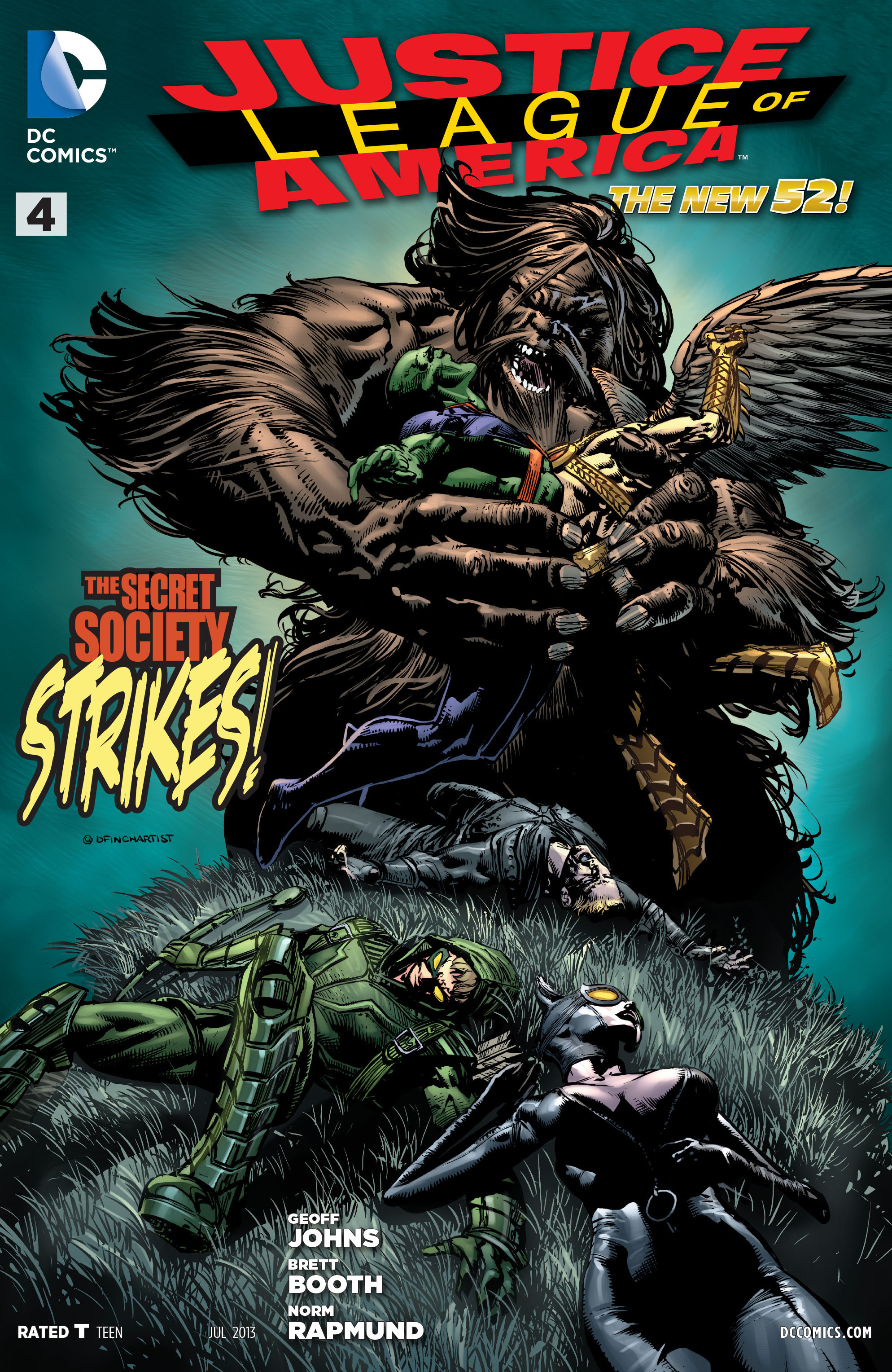
Justice League of America #4

Things are kicked into high gear as Catwoman successfully infiltrates the lair of The Secret Society! 
The JLA make their move and all does not go as planned.
Everything you could want from a team book like this is here as this issue pulls a couple threads forward while still holding back on who the mastermind of the Society is and what their goals are plus a house busting battle breaks out.
 While only on #4 Geoff Johns drops character development in favor of action with very little in the way of pathos being touched on which is a shame because the team offers plenty in interesting relationships and a sense of 'gelling' together is still nowhere to be found in the series. Action speaks louder I suppose but even so the dialogue is mainly comprised of one or another character stating what they are about to do in that panel or the following and added to this is a slew of shallow one liners that belittle good characters that deserve more.
 It's with the villains that interest prevails! A fast expanding society offers intrigue with it's cast of members while the shadowy leader holds centre stage simply by holding back his reasons and his identity. It should also be mentioned that a certain Dr. Arthur Light's involvement in this issue is also well executed being convincingly tied into the immediate plot of the Secret Society.
Th ending is a surprise but doesn't hold up for any who know Catwoman in the New 52, more interesting will be the response of a certain winged mammal themed person and why this is exactly what the Society want!
Brett Booth's art is so cool! There is no better word for it!. It's slick, real flashy but well defined pencil work and he doesn't let the images overrule the panels. The colorist, Andrew Dalhouse, does a fine job but some pages have a strange hue to the colors like a light mist is covering the page.
Lot's to enjoy and lot's still wrong here. The ending is grabbing enough to keep this reader for another issue.

Score 7/10